
Since the first series launched on Channel 4 in 2000, the show’s logo has been redesigned almost every year. It is not just branding. Each new eye usually hints at the series theme, the channel’s personality, or the mood of the moment. The result is one of the most distinctive and frequently updated identities in British television.
Here is how the all-seeing eye has evolved
The Channel 4 years: artistic, experimental, and often unsettling (2000–2010)
The original 2000 eye was based on a photograph of housemate Mel Hill’s eye. It was simple but instantly iconic.
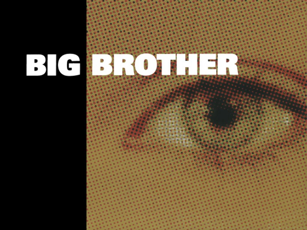
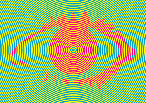
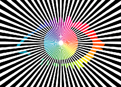
From series 2 onwards, designer Daniel Eatock took over. He treated the eye as a flexible graphic that could be abstracted while still feeling like Big Brother. Early versions used bold colours, optical effects, and simple geometric ideas. Series 3 was bright and almost hypnotic. Series 4 went kaleidoscopic. Series 5, when Big Brother “went evil,” produced a more intimidating, spiked look.
Later Channel 4 eyes became more conceptual:
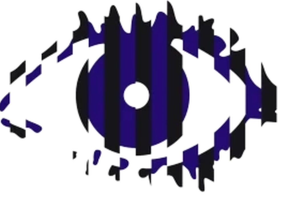
2005’s split blue-and-black design fuelled rumours of two houses.
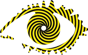
2006 used yellow-and-black hazard-style stripes.
2008’s shattered-glass version was later voted one of the best ever by fans.
2009 was based on a fingerprint.
2010, the last Channel 4 series, used a floral, almost burial-style motif as a farewell.
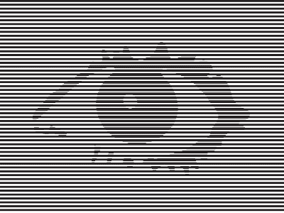
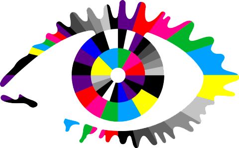
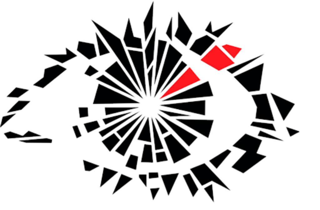
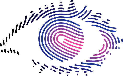
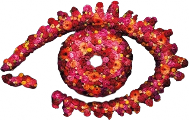
Eatock’s approach was clever: the eye always stared back at the viewer, echoing the show’s core idea of surveillance.
The Channel 5 era: bolder, more literal, and heavily themed (2011–2018)
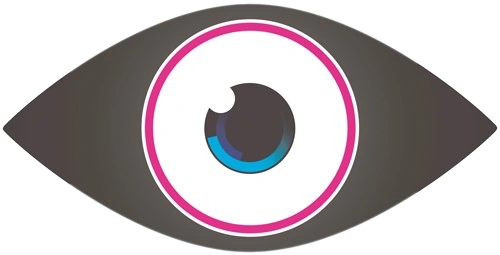
When the show moved to Channel 5, the eye became more three-dimensional and often directly illustrated the series theme. Design studio Hello Charlie (later Shop) handled much of this period.
Notable examples include:
2011: a cleaner, more mechanical “alien-style” eye for the new channel.
2013: doors, drawers, and TV screens for the “Secrets and Lies” theme.
2014: a circuit-board, sci-fi look for “Power Trip.”.
2015: a clockwork/timebomb design.
2016: a monochrome eye exploding with colourful shards.
2017: a Union Jack-inspired collage of British icons (phone box, palace gates, mosque, protest sign) reflecting a “culture clash of modern Britain.”
2018: a luminous, almost interplanetary orb described as trippy and cosmic. This was also the first time since 2000 that the logo moved away from the traditional eye shape. It was the final Channel 5 series.
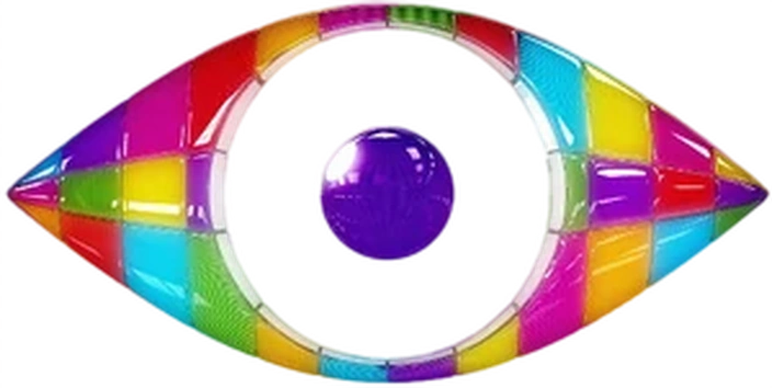
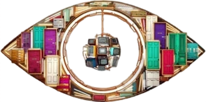
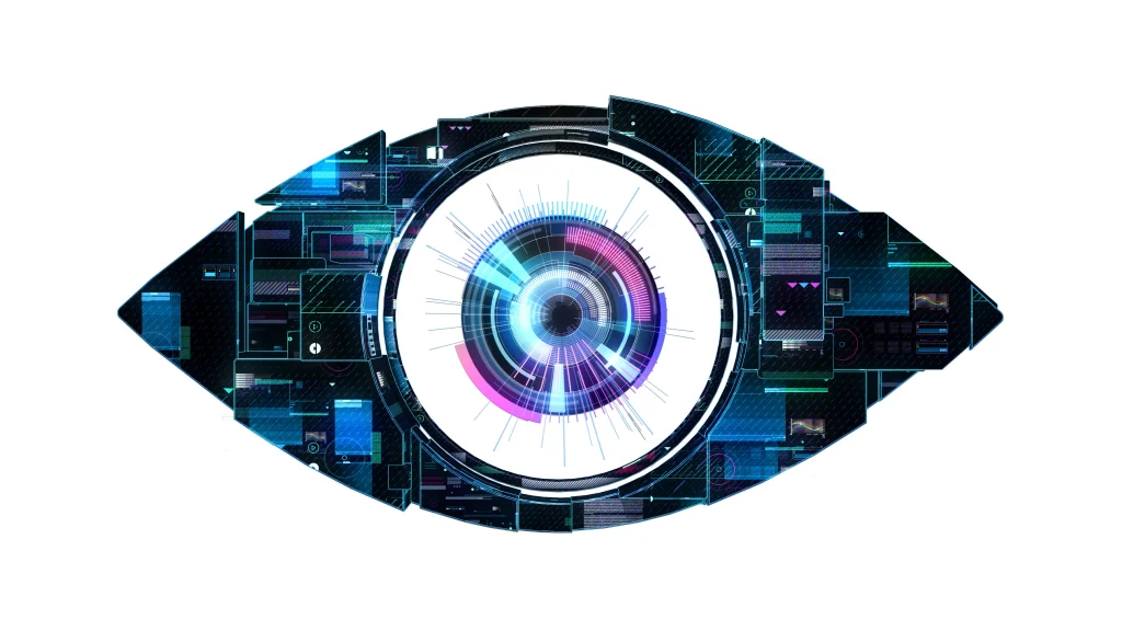
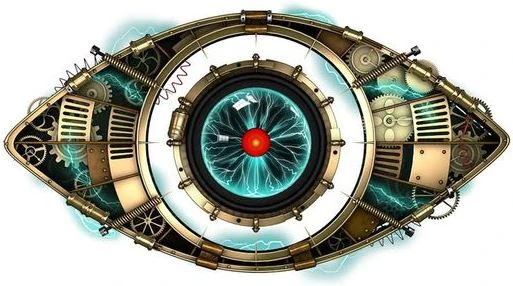
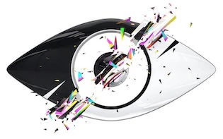
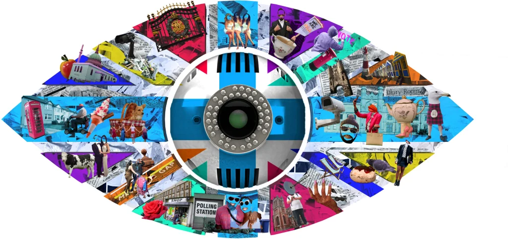
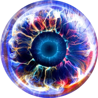
The C5 years were visually louder. The eye often felt like a piece of the house itself rather than a standalone graphic.
The ITV revival: from emoji-bright to back-to-basics (2023–2026)
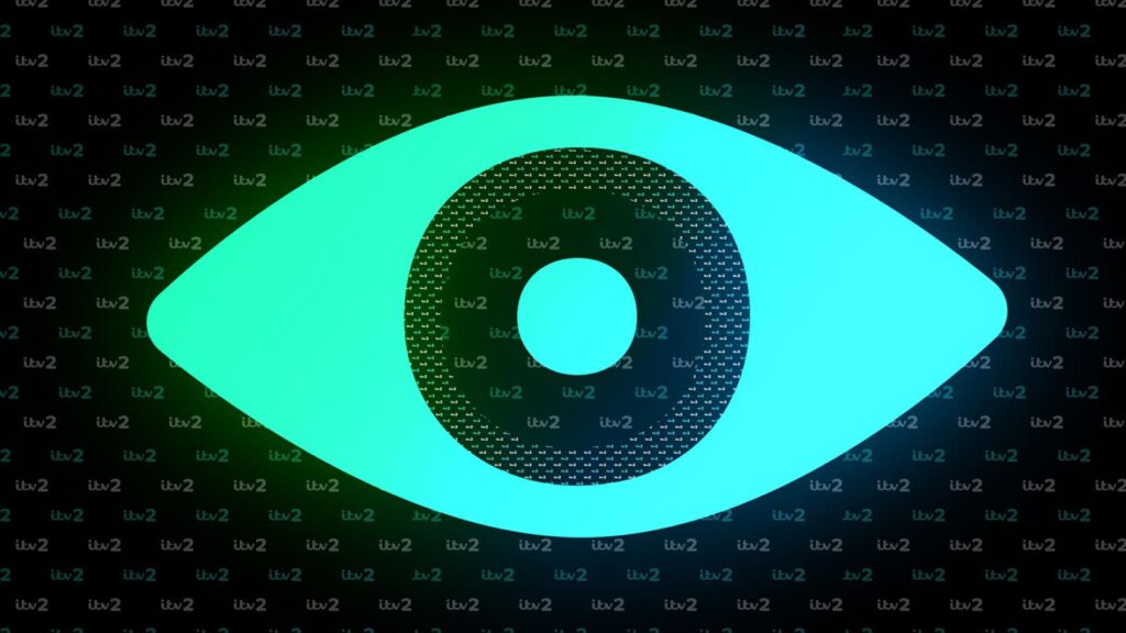
After a five-year gap, Big Brother returned on ITV2 in 2023. The new eyes have been more contemporary and, in recent years, more ambitious.
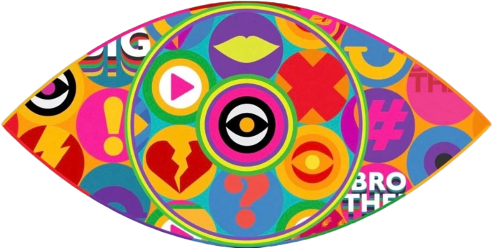
2023: A colourful, playful design covered in modern icons — lips, a broken heart, hashtag, exclamation mark. It felt like a social-media-era update.
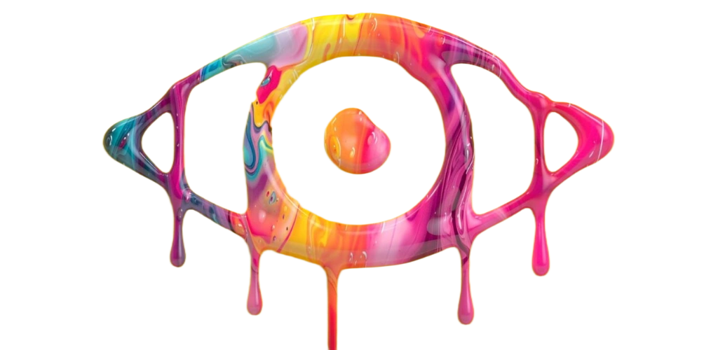
2024: Multicoloured paint dripping down a strong yellow background. Vibrant and messy in a deliberate way.
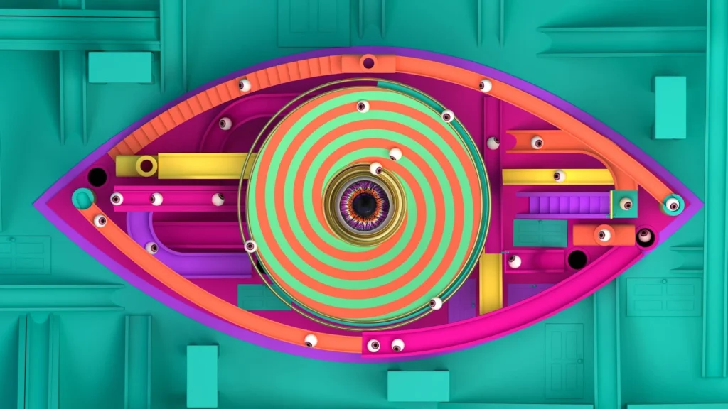
2025: A labyrinth or maze inside the eye shape, with many smaller eyeballs rolling around. It nodded to the show’s 25th anniversary and included stairs and doors.
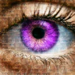
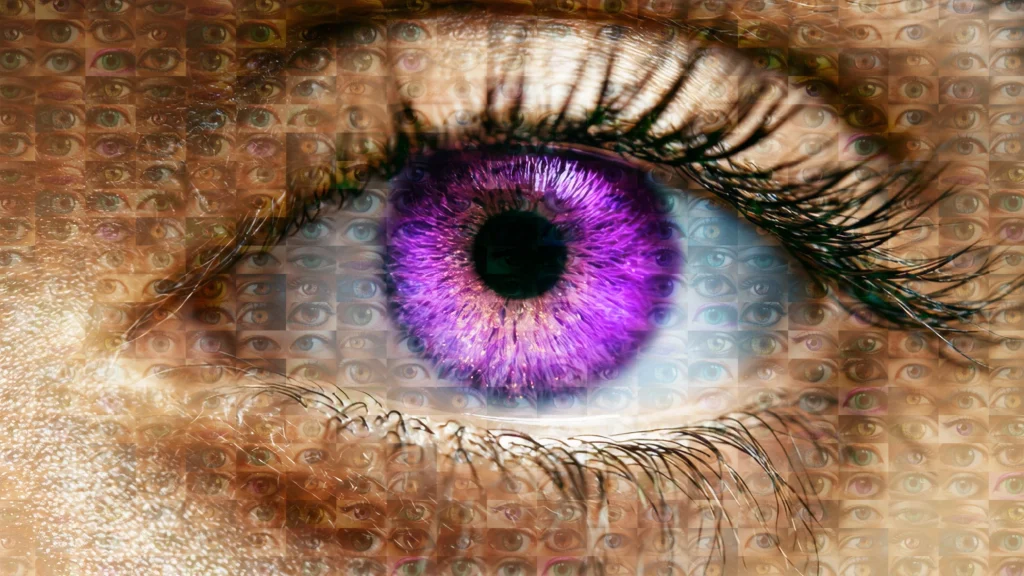
2026 (Series 23): The most striking recent change. ITV dropped the graphic, colourful style for a realistic, life-like eye with a purple iris. The background is made up of more than 400 smaller eyes. It is the first time the logo has resembled an actual human eye since the very first series in 2000. The message is clear: Big Brother is watching, and there are a lot of eyes.
Why the eye keeps changing
The annual redesign serves several purposes. It signals a new series and a new house. It lets designers respond to the theme (evil, secrets, time, Britain, surveillance). And it keeps a 26-year-old format feeling current.
Daniel Eatock once said the variations reflected the “editorial direction” of each series. That remains true. The 2026 version, with its mosaic of hundreds of eyes, feels like a return to the original Orwellian idea while using modern production techniques.
The Big Brother eye has gone from a single photographed iris to shattered glass, circuit boards, paint splatters, mazes, and now a photorealistic composite. Through every channel change, hiatus, and reboot, one thing has stayed constant: it is still watching.